

Today, I'm sharing a card I created with some of my new favorite inks, and below that I've included a feature post on why I love using them.
I've refrained mentioning them in heavy detail here before now, because I really wanted to make sure they were worthy of getting a shout-out.
I'm so pleased to say that after using them over this past year quite extensively, they definitely deserve a post of their own :)
But before we get to that, here's a quick peek at today's card.
I created this little number with just a few supplies because I wanted the inks to really shine here.
I first started with an embossing folder edger to create a subtle texture at the bottom of the card. It's such a great way to add a subtle accent, but if you don't happen to have any embossing folders such as this one, an edger die would work just as well here.

For the floral centerpiece, I used Peonies on Parade and Gran's Garden floral stamps from Papertrey Ink. I honestly can't get enough of these two beautiful stamp sets!
For the large peony and leaves, I used Versamark ink and white Ranger Fine Detail Embossing Powder, to heat emboss the images. I used Tim Holtz Picked Raspberry to watercolor the pink flower, and Shabby Shutters to watercolor the leaves. I love how vibrant both of these colors are :)
For the other solid-style florals, I used ink colors of Tiger Lily, Venetian Orange, and Buttercup.
All of these colorful shades are from the Archival Ink collection. To learn more about these inks, just scroll to the end of the post. I've compiled some of the things I absolutely love about these inks and I hope it helps you out :)

Before adhering the florals to the card base, I stamped a heart border using Garden Patina Archival ink, and then stamped the sentiment in Archival ink as well, using colors of Buttercup, Tiger Lily, Garden Patina, and Leaf Green. The bright pink was stamped in Picked Raspberry Distress ink, and
the softer pink used is from PTI's Pale Peony.
I like how the embossing folder created a de-bossed area that was just the perfect size for this sweet sentiment. I also thought it was ultra-fitting to make the sentiment multi-colored. I find that this multi-colored style of stamping brings so much life and vibrancy to a sentiment - especially one as positive and uplifting as this one.
To easily add each color, I used a stamp positioning tool. For those of you who haven't used a stamp positioner, it truly is an uber nifty tool! Your stamp stays in perfect position at all times, so you can easily play around with different techniques such as simply alternating the parts of the stamp you ink, allowing you to stamp multiple different colors.

Once all the colorful bits were assembled, I added a dash of sequins, and my simple card is all set to go. I really am a fan of how lovely and vibrant this card is! And I'm so happy to share my new favorite inks that helped me achieve these lovely tones.
**Please Note : This is not a sponsored post. I am simply sharing information on a product I love.**
I've long been a fan of the crisp impression that can be achieved with the black Archival inkpad, but didn't quite realize that the same awesome inkpad was available in many colors, too.I was introduced to all the lovely colors by a dear friend, when I was in need of some colorful ink that would stay permanent on fabric. My friend was kind enough to lend me her entire ink collection so I could give them a whirl. After playing with them, I couldn't believe how wonderful they were, and I was convinced I needed them. Not only because they worked perfectly on my fabric project, but also because they were so versatile.
I am such a huge fan of PTI water-based dye inks, but I did find that water-based ink was not going to cut it for every type of project. I had been looking for a compliment to my PTI ink collection, and I was so glad to re-discover this ink because it was the perfect way to complete my ink collection.
Since this ink has been around a while, I know most of you have ran across it, so I'm keeping my info on it brief. Should you have any additional questions, please leave me a note in the comments section and I'll be sure to answer.
______________________________________________________________________
PRODUCT FEATURE: RANGER ARCHIVAL INK
Oil Based
This line of ink is a little different than most dye inks, in that it is not water-based, rather oil-based. This means that it will not react with water. It is not an ideal ink if you like using your dye ink as a watercoloring medium, but it is perfect for using with mixed media and watercolors, without worrying about smudges and colors running. The only medium I would not recommend using this ink with is solvent or alcohol based markers, such as Copics or Spectrum.
Perfect Coverage
This ink is a dream to stamp with! It works perfectly on all types of stamps. It produces crisp, even, bold coverage on all types of stamps, including lower quality acrylic stamps. This ink has given me a whole new appreciation for stamps that were getting no love from me lately, because I just didn't like how unevenly the images would stamp with almost any other ink I tried. This feature alone was worth the investment for me.
Vibrant Colors
O my gosh, can we pause for just a second and talk about the colors?!?!
They are so dreamy, and beyond beautiful! They also happen to be just the perfect compliment to my Papertrey dye ink collection. They fit in between some of my favorite PTI ink colors, to cover some of the color gaps. I also love some of the softer shades available, such as Sap Green, Tea Rose and Pale Ochre. The colors stamp well, but are so soft and delicate. I've never come across an ink that stamps such pale colors so evenly.
Available in Mini Sizes
Also, and this is a big one for me, most of the colors come in mini sizes!! When I purchased the inks, only the larger pads were available. But I loved them so much that I made an exception to go full-size. I typically only purchase cube inks. Not only are they easier on the pocketbook, but so much easier to store, and take on-the-go too. I am so happy to finally see that they offer smaller sizes now.
Stamp on Many Surfaces
Because they are oil-based, waterproof, and permanent, they can be used to stamp on all types of surfaces such as vellum, acetate, wood, metal, fabric and glossy cardstock. Just a wee bit of heat setting on glossy surfaces will set these beautiful colors. Talk about versatility!
Non-Toxic
This may not sound like a big deal, but considering how much time we crafters spend with our art supplies, and how easy it is to transfer copious amounts of ink all over our hands, it's nice to know that all of the above properties come without the hazards of toxic chemicals.
The Downside
Really the only down side, is that they can stain some higher quality photo-polymer stamps, but I have found that by inking up your stamps with a water-based very light color, such as PTI's Sweet Blush or Soft Stone inks, and then applying this ink overtop, it can reduce the amount of staining.
______________________________________________________________________
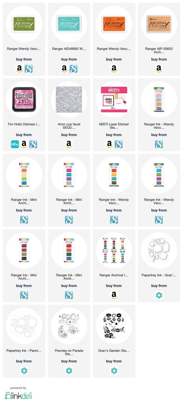
So now that you know all the properties, I wanted to share the color swatches of the tones I picked up, in hopes that it will give you a bit of a glimpse into the kind of colors available. I also made sure to grab a matching re-inker for all of the pads, so that I can use these colors for years to come.
______________________________________________________________________
So now that you know all the properties, I wanted to share the color swatches of the tones I picked up, in hopes that it will give you a bit of a glimpse into the kind of colors available. I also made sure to grab a matching re-inker for all of the pads, so that I can use these colors for years to come.
Here are the shades I picked up:

1 | 2 | 3 | 4 | 5 | 6 | 7 | 8 | 9 | 10 | 11 | 12 | 13 | 14 | 15 | 16 | 17 | 18 | 19 | 20 | 21 | 22 | 23 | 24 | 25
I recommend all of the above colors if you are looking to fill in Papertrey's collection, or if you'd simply like to have a good variety of hues in this collection. Some colors are rather hard to come by, but I've tried to source a link for each color's corresponding number.
And here is how some of them compare to Papertrey Ink colors:

GREENS - Top row Papertrey Ink (correction: Green Leaf should be New Leaf), Bottom row Archival Ink

TEALS - Top Row Archival Ink, Bottom Row Papertrey Ink

BLUES - Top row Papertrey Ink, Bottom row Archival Ink

PURPLES - Top Row Archival Ink, Bottom Row Papertrey Ink

PINKS - Top row Papertrey Ink, Bottom row Archival Ink
You can find plenty of these delicious colors in the following mini packs:
Kit 1
Kit 2
Kit 3
Kit 4
Kit 5
Kit 6
Kit 7
Kit 8
I've also added links for the mini packs below. For harder-to find colors, visit the Ranger website for a full selection of hues.
I'm afraid the photos really don't do these inks justice, but I will be featuring them more and more in my upcoming projects, so stay tuned if you are interested.
I really hope this post was helpful and that if you happen to be on the lookout for a new, versatile ink collection, that this post will save you a bit of hassle.
If you do end up investing in this ink, please come back and let me know your thoughts and/or share your projects. I would love to see! :)
Thanks for joining me for today's product review! Wishing you all a wonderful week!
Ivana
p.s. Friends - I'm trying out a NEW supplies list that will be featured at the end of each post. I hope it will make shopping a little easier and allow you to quickly see products I've used on each project. Using this feature will not add any additional costs to your purchase, but it will go a long way in helping me maintain this little blog of mine. Your purchases through any of the AMAZON, BLITSY or SCRAPBOOK.COM links below will help me convert a small portion of your sales towards running this little blog and creating new, exciting content on an on-going basis. So if you like what you see here and you enjoy visiting my creative space, please consider using these links when you shop.
Also please note, although I do make a small commission on the sale of some products I feature, all products used on this blog and opinions shared are my own and are not influenced in any way.
I simply love to share the goodies that make crafting fun for me, in hopes that they'll do the same for you! :)
I want to extend a HUGE thank you to anyone who has already used these links! Your support means the world to me and I cannot express my gratitude enough. Thank you!


Your card is beautiful and what fabulous colors you've used! Thanks for the info on the inks. I always like knowing now what others think before trying them out. I've been disappointed too many times before!
ReplyDeleteOh I know, Lisa, I am totally in the same boat. I was so fortunate that my dear friend lent me her inks so I could give these a try. Really love them to bits!
DeleteBeautiful creation Ivana~love those vibrant colors! Your organizing skills are super impressive. I'll have to give those inks a try~I've got a little here and a little there.
ReplyDeleteThank you so much, dear Marlena! I hope the inks work out for you - please let me know if you happen to have any specific questions! Sending hugs :)
DeleteWow! Thanks for the ink lesson and color comparisons! I have been experimenting with just about every ink out there to find the one that does exactly what I want, from PTI's to Mementoes, to Lawn Fawn, and everything in between.... While I do love Tim's Distress and Distress Oxides, especially, I think I need to check out the Archival inks now to get the fuller coverage I am looking for..... Thanks for your help on all this. Your card is beautiful, too, of course. And again, thanks for the fundraiser on behalf of the Humboldt Broncos team. You are such a dear.
ReplyDeleteAw, Dianne, I'm so glad this was helpful! You know, I really, really love this ink and I hope you do too! If you have any specific questions, please feel free to send them my way and I would happy to answer :) And THANK YOU so much for all of your support and donations over the past week. I am so very humbled by your incredible generosity and caring heart. Sending you big hugs, dear crafty friend!
DeleteIvana---- wowza! I looooooooove all the projects that I've seen on your blog just from visiting this one time and scrolling down! I am definitely going to have to follow you/stalk you---- major talent shared here:) THANK YOU for your sweet comment on my blog post- you made my day <3 THANK YOU!!!!!!!!!
ReplyDeleteAs for this project- WOW! What a beautiful card! And with just inks as the main element! FABULOUS <3
O my goodness, Savannah!! I feel the same way about your beautiful cards! You are crazy talented and I am IN LOVE with your cardmaking style! I think there will be a fair amount of stalking going on on this end too :) Sending you big, big hugs! Thank you for the super sweet note + for stopping by to visit! :)
DeleteI love when you go vibrant in your creations and I just love Archival inks!!! They are great but now i see I have to extend my collection ;) xoxo Milion hugs you way my friend ! Aneta
ReplyDeleteOh, they're so fabulous! I have a feeling I'll be adding more colors to my collection too ;) Thank you so much for the sweet note my dear friend. Missing you so much!!
DeleteWow, it's really helpful seeing all these colors printed. So much clearer than just looking at the packaging. Thank you!
ReplyDelete