
Helooo everyone! Have you been having a good week so far?
I hope all is well wherever you may be!
Over the course of this past year, I've dabbled a bit in different techniques and card styles. And I've started to realize that some of my cards fall into the traditional style you've all come to know from me, while some have started to morph into a more simple and clean category. And then there is also a third, completely new look for me.
I decided that a fitting title would be "Painted Cards" because they require a tad more artistry, a few more mixed mediums, and at times, a bit of painting. Today's post is all about how to achieve this look.
But do not fret - even if you are not a painter or an artist, these types of cards are so doable.
I'd love to share just a few of my go-to tips here with you today!

______________________________________________________________________
TIP: USING 'PAINTED' PRODUCTS
TIP: USING 'PAINTED' PRODUCTS
When selecting stamps, in particular, it is super helpful to use products that allow you to layer multiple colors into the final image. Floral stamps are notorious for this, but more and more wording stamps and other images are becoming available, too. In most cases, stamps that feature shading and accent layers will be a great start to your artsy, painted card!
______________________________________________________________________
______________________________________________________________________
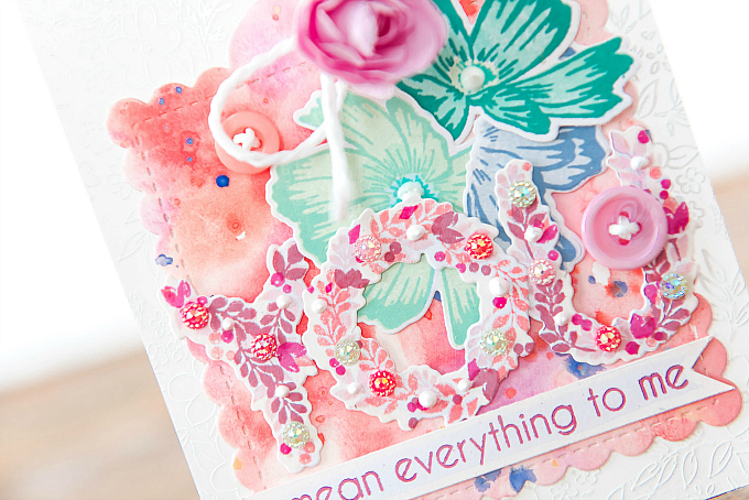
For the above card, I used two of my new favorite Altenew stamps - you can find them here and here. I've been told before by fellow crafters that they don't always enjoy working with layer stamps such as these because they can be so hard to align. I currently use + love the Misti tool to line up my stamps, but every so often I get lazy, and I just wing it! Even though I don't get everything lined up perfectly, I really don't mind so much. Especially for these types of cards which are more forgiving and lend themselves nicely to an imperfect look.

______________________________________________________________________
TIP: USING PAINTED BACKGROUNDS
Whether you use a patterned paper, stamp your own cardstock, or actually paint a background, all of these options will instantly transport your card into a creation that looks a bit more artsy.
Although I love the ease of picking up a painted-style patterned paper, I usually end up making my own because I can have more control over the color, texture and style of the background. And it really doesn't take much to make it look impressive!
______________________________________________________________________
______________________________________________________________________
For example, in the card above, I used a little bit of pink, coral and orange watercolor to drop pools of color on to my paper. Once dried, I simply flicked a few contrasting colors of paint, and that was it!
But a similar look could be achieved by just placing some dye ink + water on your craft mat and smooshing your paper about.
______________________________________________________________________
TIP: KEEP OTHER ACCENTS SIMPLE
When finalizing the design, it can be easy to get carried away with more accents, but for this particular style, I've found it best to stick to simple finishing touches. A rhinestone or two, maybe a few sequins, Nuvo drops, or a button is really all that's needed to bring the look together.
For the background, I usually stick with a plain white cardstock, but if you really want to take it up another notch (without distracting from your "art"), you could add a vellum base embossed with your favorite print in a monochromatic tone, much as I did here with this adorable Altenew set.
______________________________________________________________________

I promise that keeping these tips in mind, your cards will instantly look more painted and artsy, even if you don't consider yourself either of those ;)
I hope you'll give it a try!
Thanks for joining me,
Ivana


I like your artsy painted look! It's not overly artsy, it's just the right amount to draw one in. Those foliage letters are just as sweet as they can be. Another delightful card Ivana!
ReplyDeleteThank you so much, Lisa! Aren't those letters the sweetest? I have a feeling I'll be using this set again and again until it's well worn ;)
DeleteWhat ever words, or terms you use for your many styles, I call it Feminine Perfection! Just exquisite, Ivana! xx
ReplyDelete=] Michele
Aww, thanks Michele! That is awfully kind of you!! xo
DeleteAnother juicy yet delicate creation! I see that "our" tag die is definietly your fave these days! miss you a bunch! xoxo
ReplyDeleteIt really is! And every time I use it, I think of you :) Perhaps that's why its so dear to me! Missing you heaps too xo
DeleteGreat tips, Ivanna! Your background is beautiful & something I love to do, except I never thought to use a contrasting color (other than black) for the splatters--love yours! The white embossing on the card front is perfect! Love your card!
ReplyDeleteThank you so much, Greta! So glad you like the colorful spatters! Sending hugs xo
DeleteYou make such beautiful art.
ReplyDeleteAw, thanks Mary-Ann! Right back atcha! xo
Delete